Improving mobile accessibility
My role involved creating more accessible mobile products. I worked with mobile developers to manually test a new mobile product before it was launched.
Scope of work
My goal was to show the design team how to make the mobile application of the new accounting product more accessible and compatible with mobile screen readers such as VoiceOver and Talkback.
Things I did
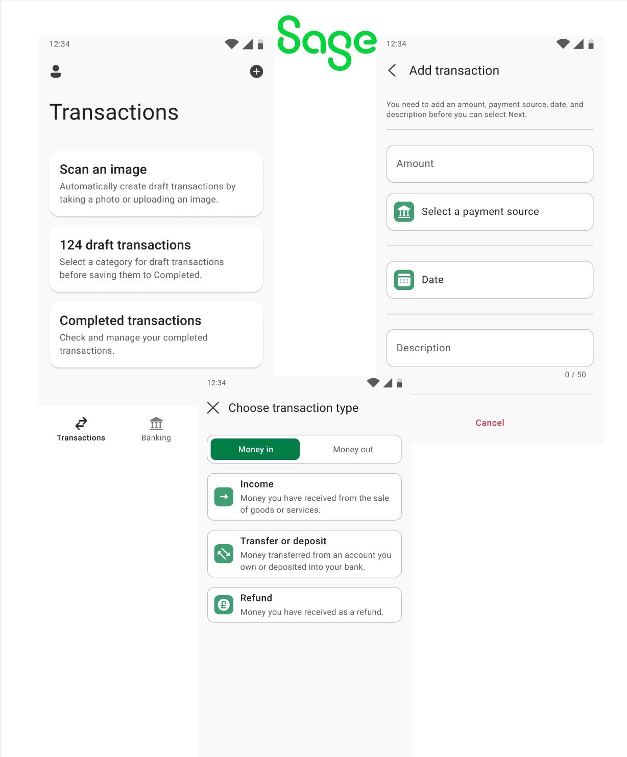
Picked 3 different mobile screens that had different components such as tiles, toggle buttons, cells, text fields, number fields, drop down list and a date picker. I wanted to test a range of elements so I could find out:
If the elements have appropriate semantics such as are buttons actual buttons, are labels actually labelled and what is read out.
Whether non-text elements have text alternatives that convey the content or function.
If decorative images are hidden for example those icons that we are used to seeing on an app screen.
If the elements are in a sequential order.
I used a range of testing techniques such as navigating the screen by:
Touch which is dragging your finger and double tapping
Swiping right and left, up and down the screen
Scrolling with two fingers
Results and impact
Implemented 12 recommendations and resulted in the app being compliant with web content accessibility guidelines.
This contributed towards meeting the company's 5 year plan of increasing app accessibility by 30% in new products.